
CLIENT
STAEDTLER
SECTOR
Stationery

STAEDTLER Website Relaunch

How STAEDTLER evolved its digital brand presence from a corporate website into an inspiring product and content experience

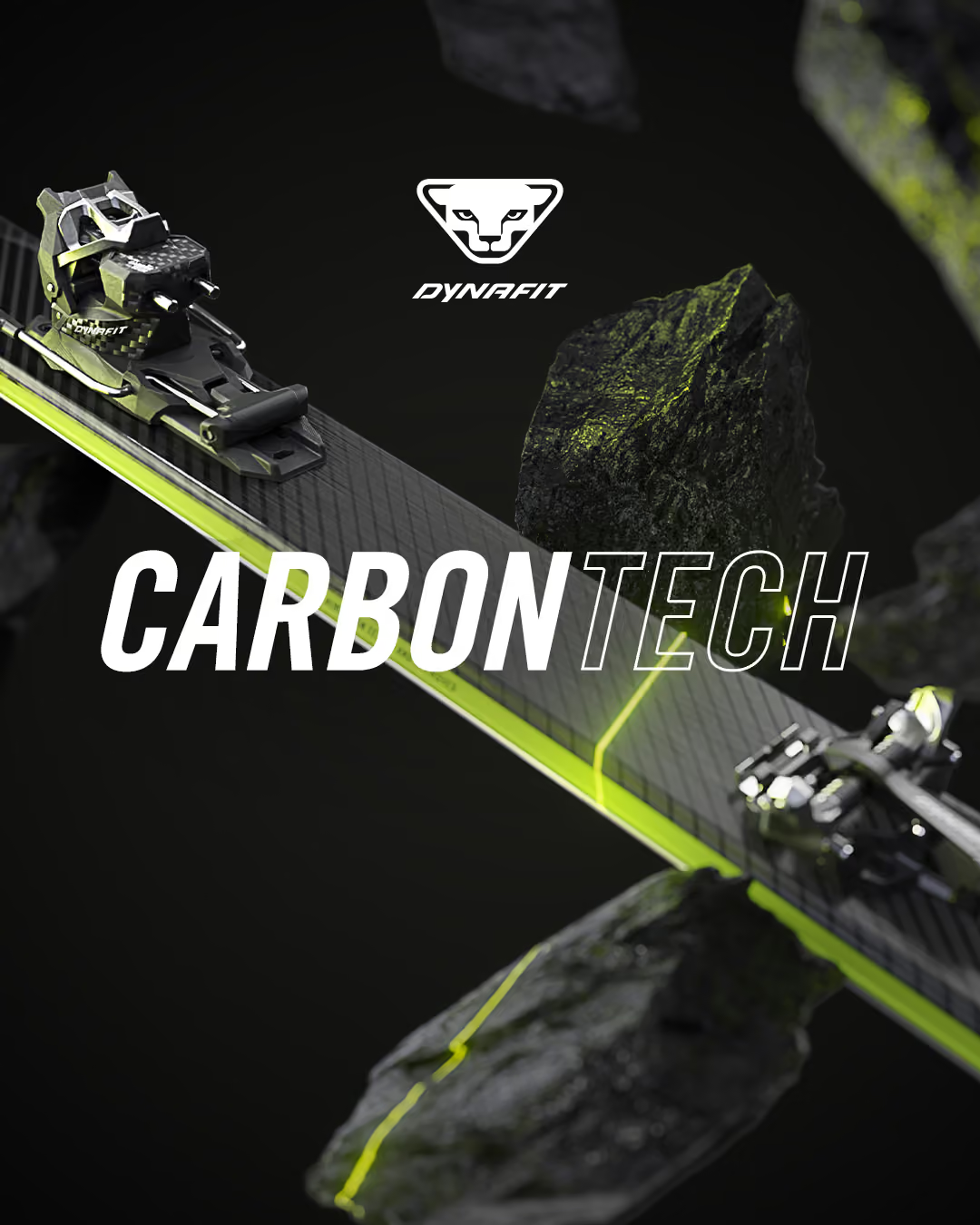
DYNAFIT stands for technical precision, lightness, and uncompromising functionality in ski touring. The Low Tech binding is an icon in the brand’s history, yet its origins were barely known among younger audiences. The planned limited reissue deliberately moved beyond DYNAFIT’s usual minimalist brand appearance. At the same time, the visual framework had already been defined by an existing poster. The challenge was to reference the strong heritage of the 1980s without losing the brand’s technical credibility. The goal was to create attention without appearing arbitrary.

The reissue was intended to function economically as a limited drop while strategically strengthening the brand’s emotional dimension. DYNAFIT wanted to show that technical excellence and cultural boldness are not a contradiction. The collection was meant to serve as a conversation starter and create new touchpoints with the brand. The campaign, content, and point of sale were designed not to explain the products, but to stage them. Success was defined primarily through perception, attention, and brand experience along the customer journey.

The brand deliberately revealed an unexpected, emotional side and expanded its usual functional image with cultural relevance.

The limited collection was perceived not only as a product, but as an experience and a statement in the market.

The campaign generated high attention across all touchpoints – from go-to-market to POS and social media.

The brand’s heritage was actively used to increase differentiation and desirability in a highly competitive category.

STRATEGY
Transformational Branding Framework
Strategy

The starting point was a conscious return to the brand’s DNA and the origins of the Low Tech binding. Archive material and research provided the foundation for building a narrative bridge between brand values, product history, and the spirit of the 1980s. The strategic guiding idea was a maximum contrast between ascetic technology and excessive aesthetics. This clearly differentiated the positioning of the collection from the rest of the portfolio without breaking the brand strategy.

DESIGN
Transformational Branding Framework
Design

The visual appearance referenced the design language of the 1980s with neon colors, strong contrasts, and deliberately exaggerated key visuals. Imagery, color palette, and styling existed in the tension between retro aesthetics and modern staging. The look intentionally broke with DYNAFIT’s usual visual identity, making the collection instantly recognizable. Tone of voice and visual codes were inspired by original advertisements and pop culture references from the era.

EXPERIENCE
Transformational Branding Framework
Digital

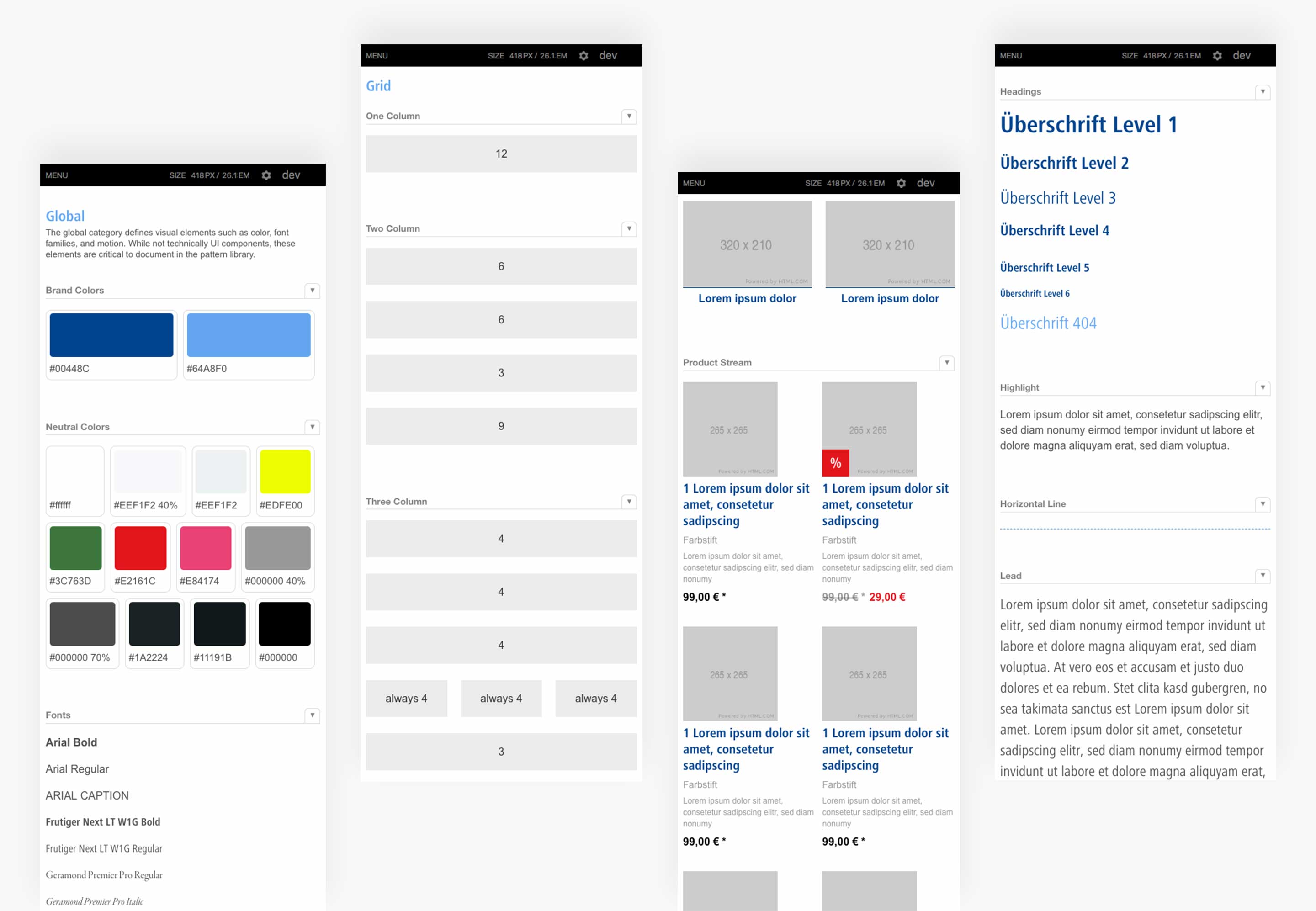
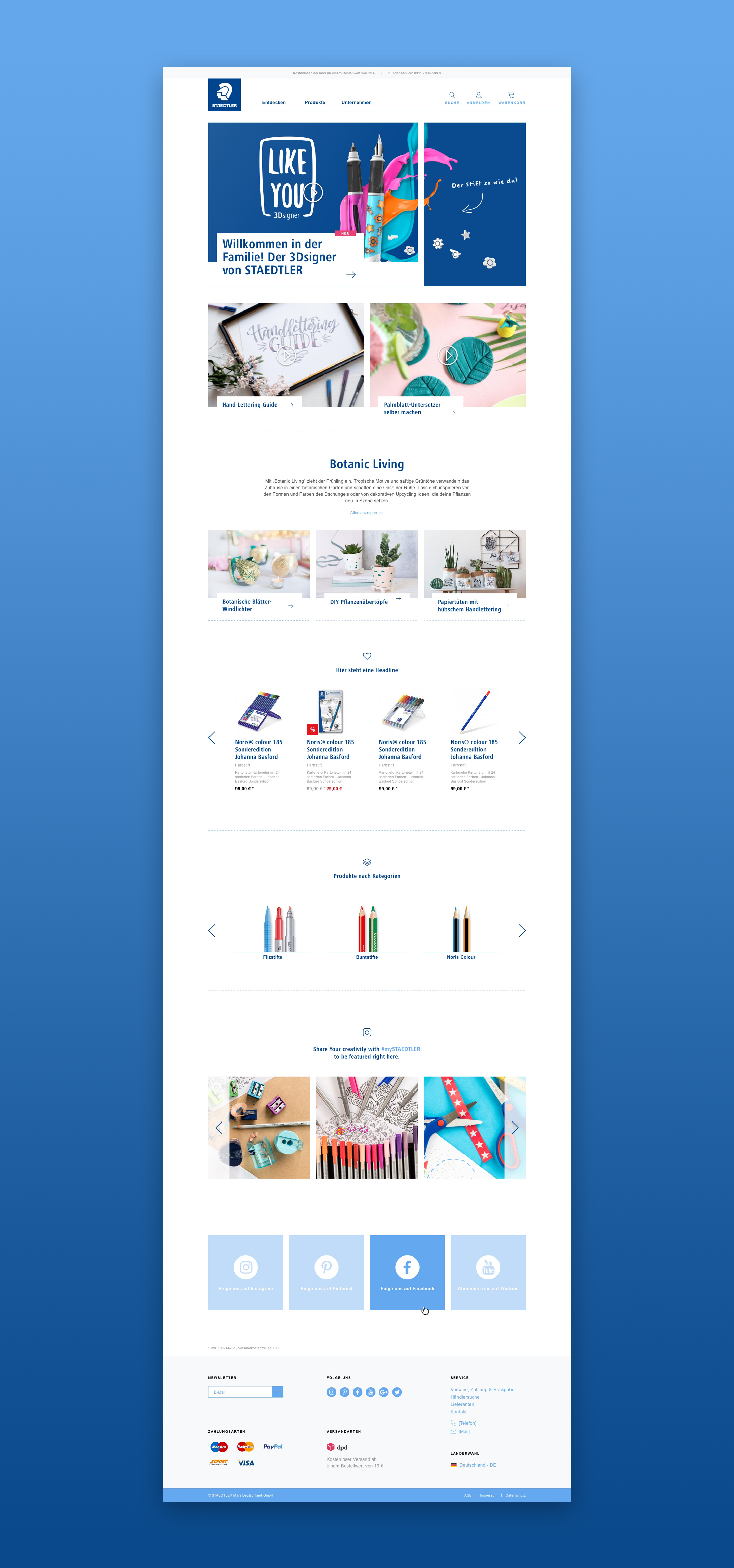
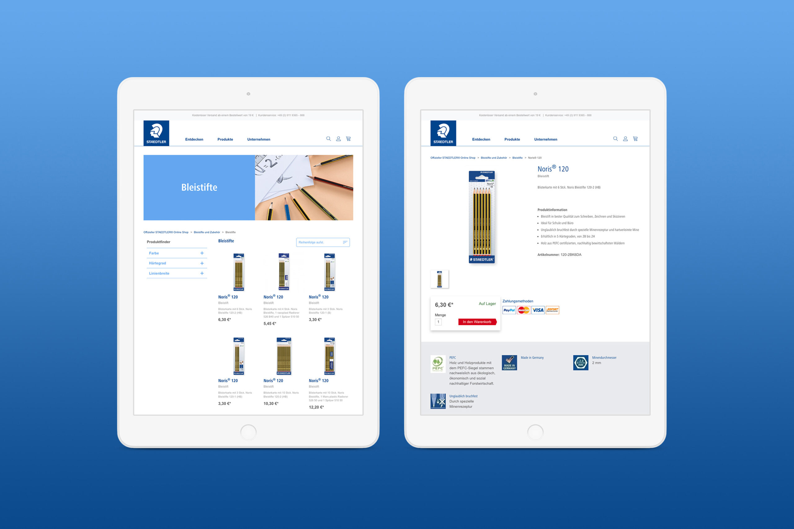
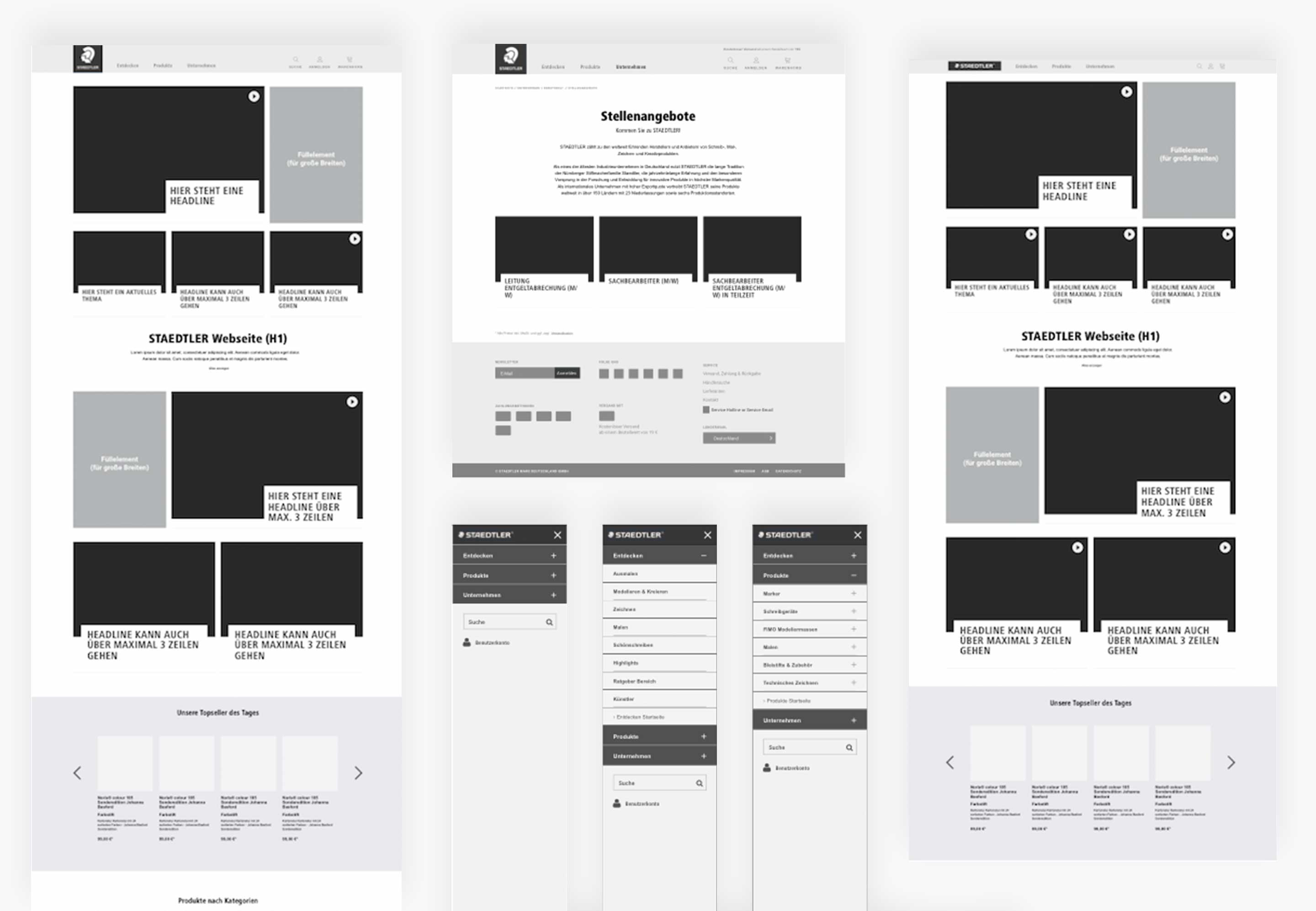
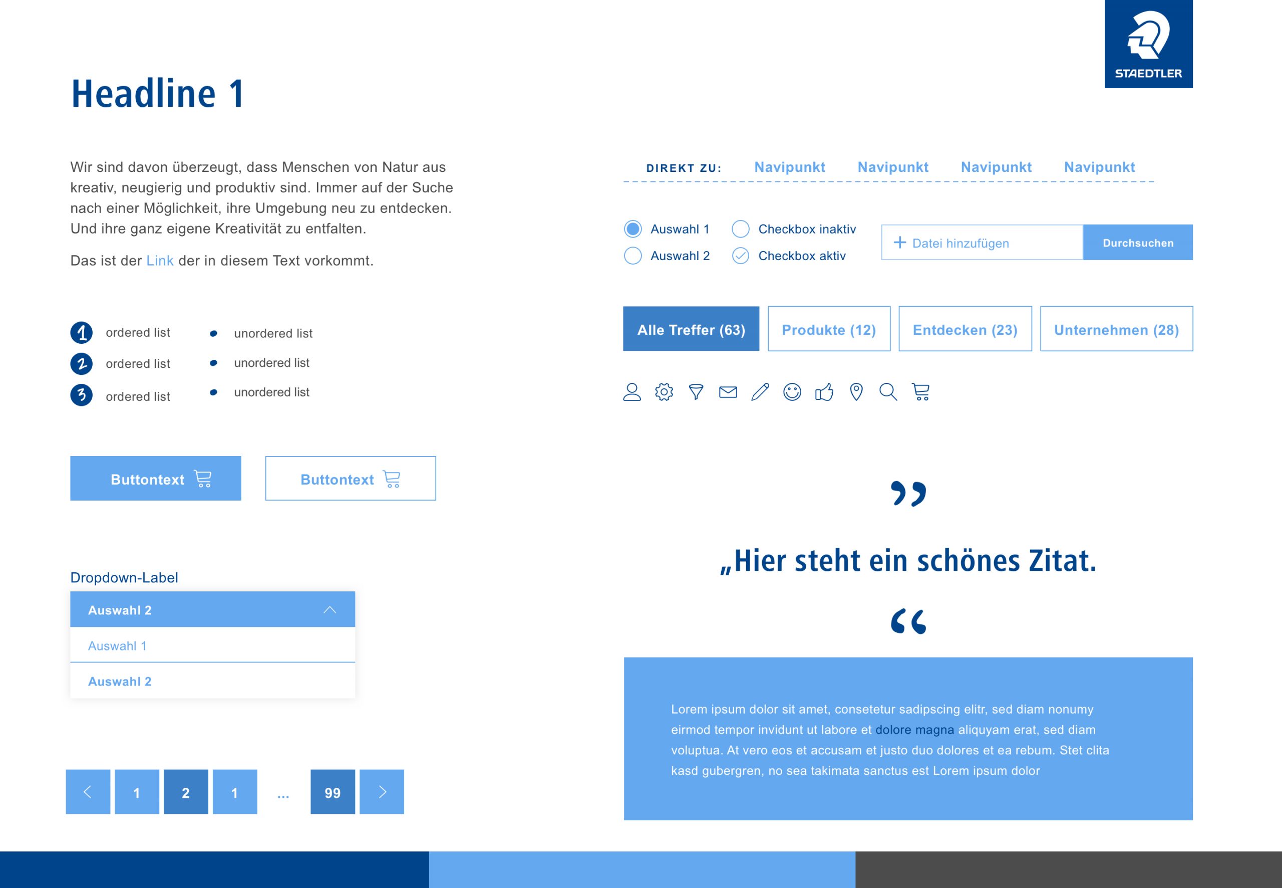
Im Mittelpunkt der Experience stand die Verbindung von Corporate Website, Content und Shop zu einer nahtlosen User Journey. Wireframes, Prototyping in InVision sowie UX Design und User Interface Design halfen dabei, Struktur, Navigation und Interaktionen früh überprüfbar zu machen. Besonderer Fokus lag auf mobiler Usability, verständlicher Informationsarchitektur und einem hohen Joy of Use durch charmante Micro Interactions. Die Umsetzung in agilen Prozessen ermöglichte eine enge Abstimmung mit allen Beteiligten und eine Website, die Marke, Inspiration und Produktzugang deutlich besser zusammenführt.

What other transformations has stilbezirk made possible?

Further projects that move brands.