CLIENT
Fortimel®
SECTOR
Healthcare

Fortimel® PlantBased Energy launch campaign: Fully plant-based, nutritionally complete.

How Fortimel® is paving the way for plant-based medical nutrition

The desire to follow a vegan or plant-based diet has increased significantly over the past ten years. This trend is also evident among patients who require medical nutrition therapy. With the 2023 launch of Fortimel® PlantBased Energy, the brand is introducing a new, innovative product that is unique on the market.

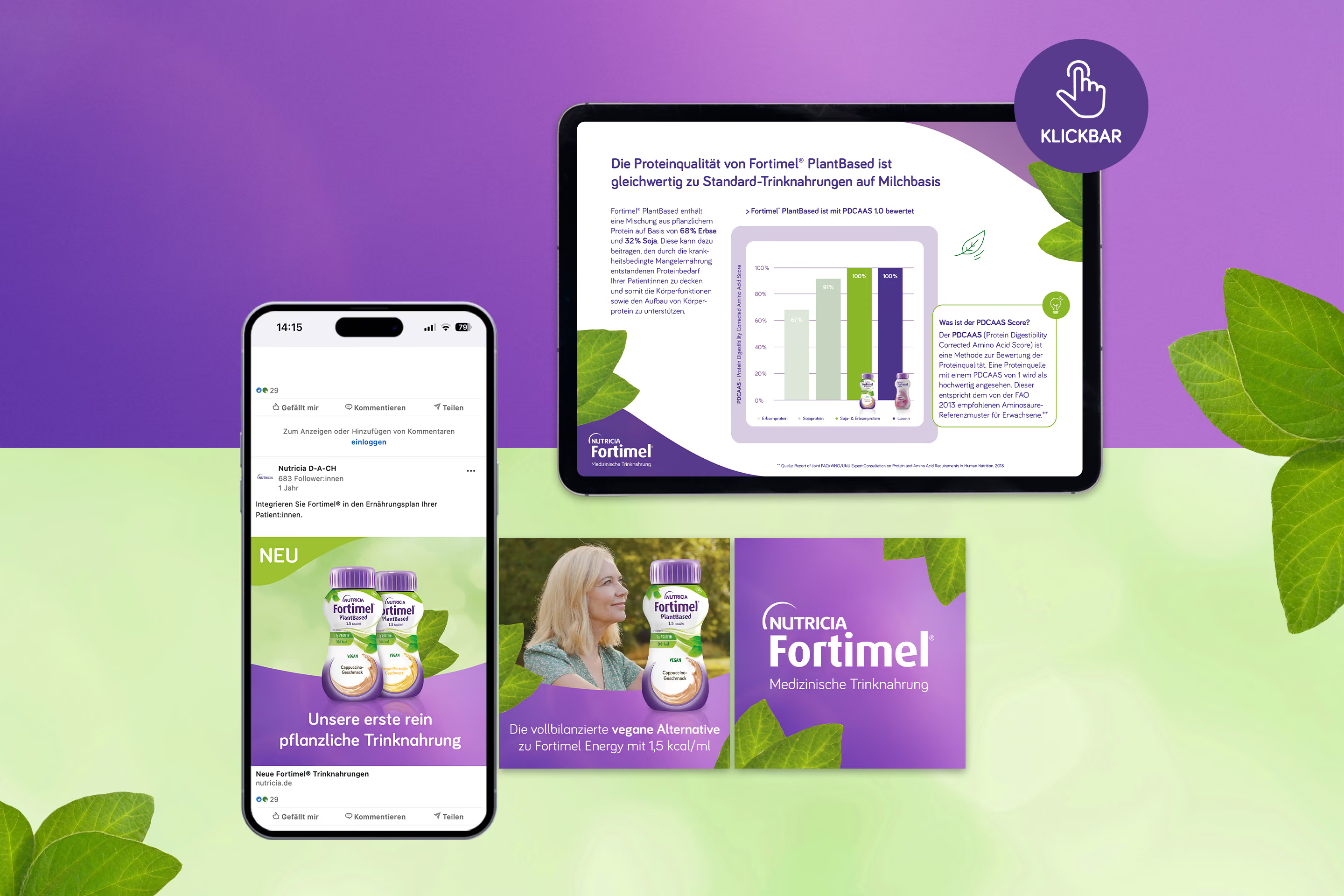
A 360° campaign was designed to support the launch and raise awareness of the new product among target groups. To achieve this, parallel "Health Care Professional" and "Direct-to-Patient" activations were planned across various touchpoints for both audiences.

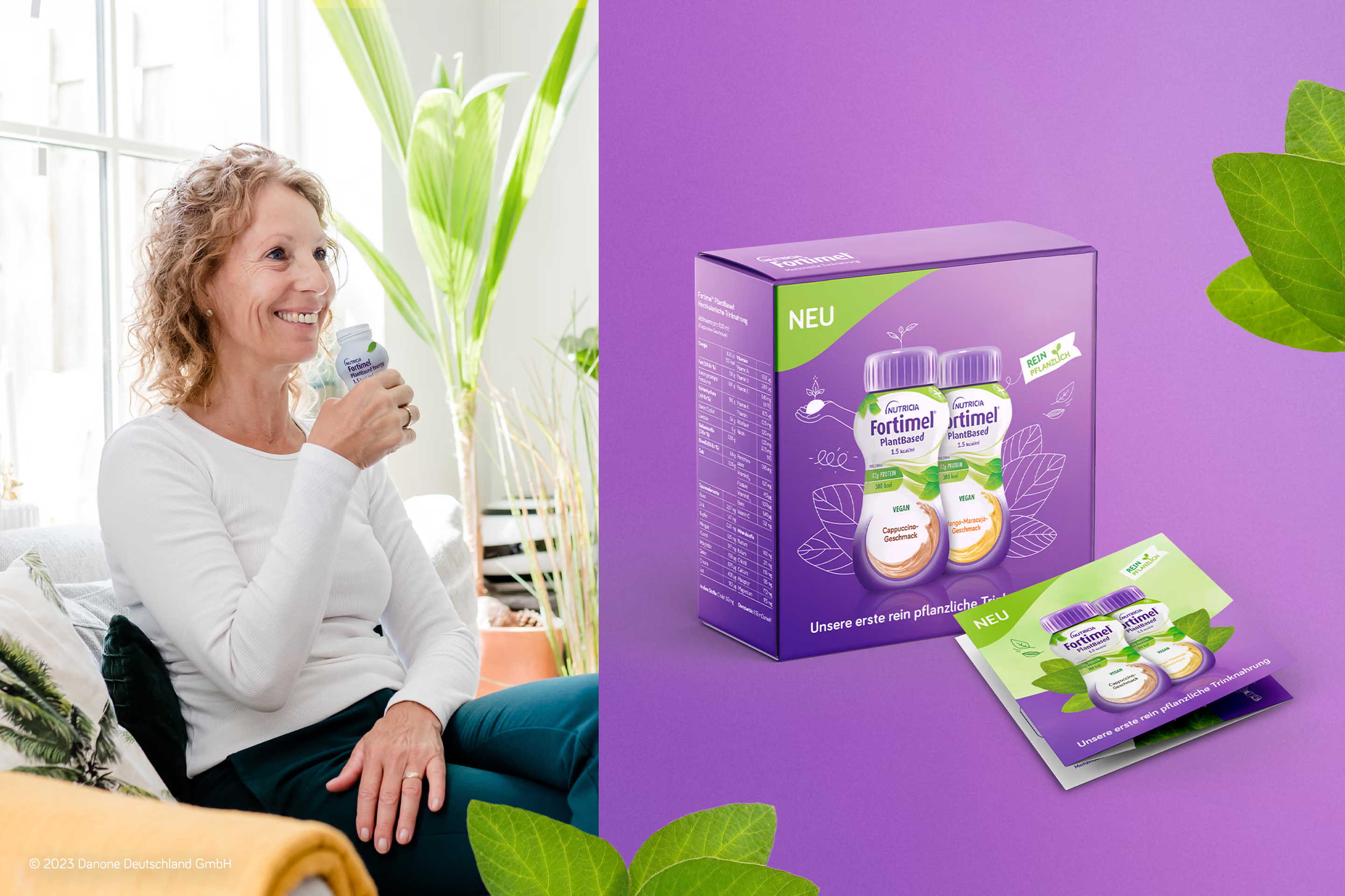
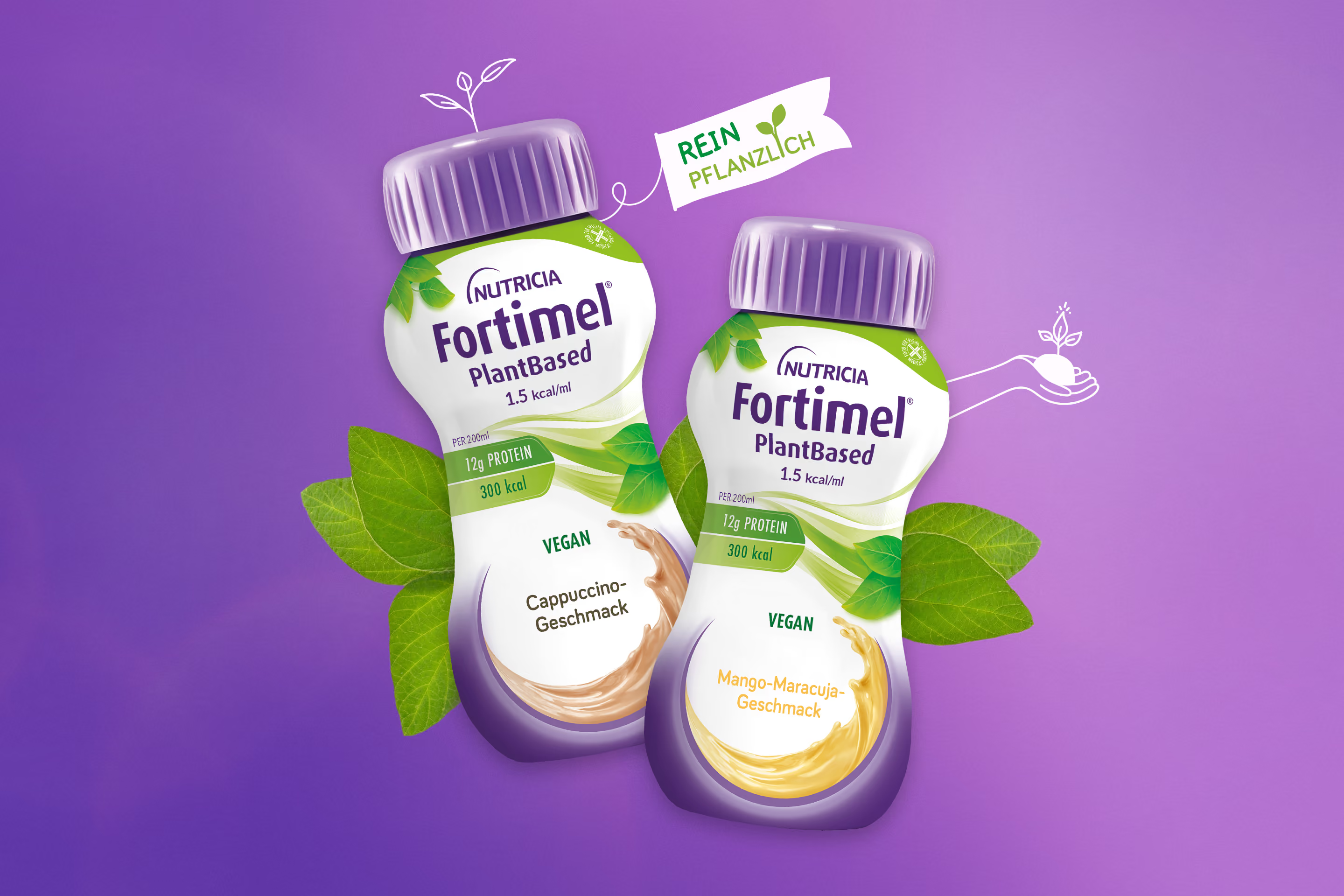
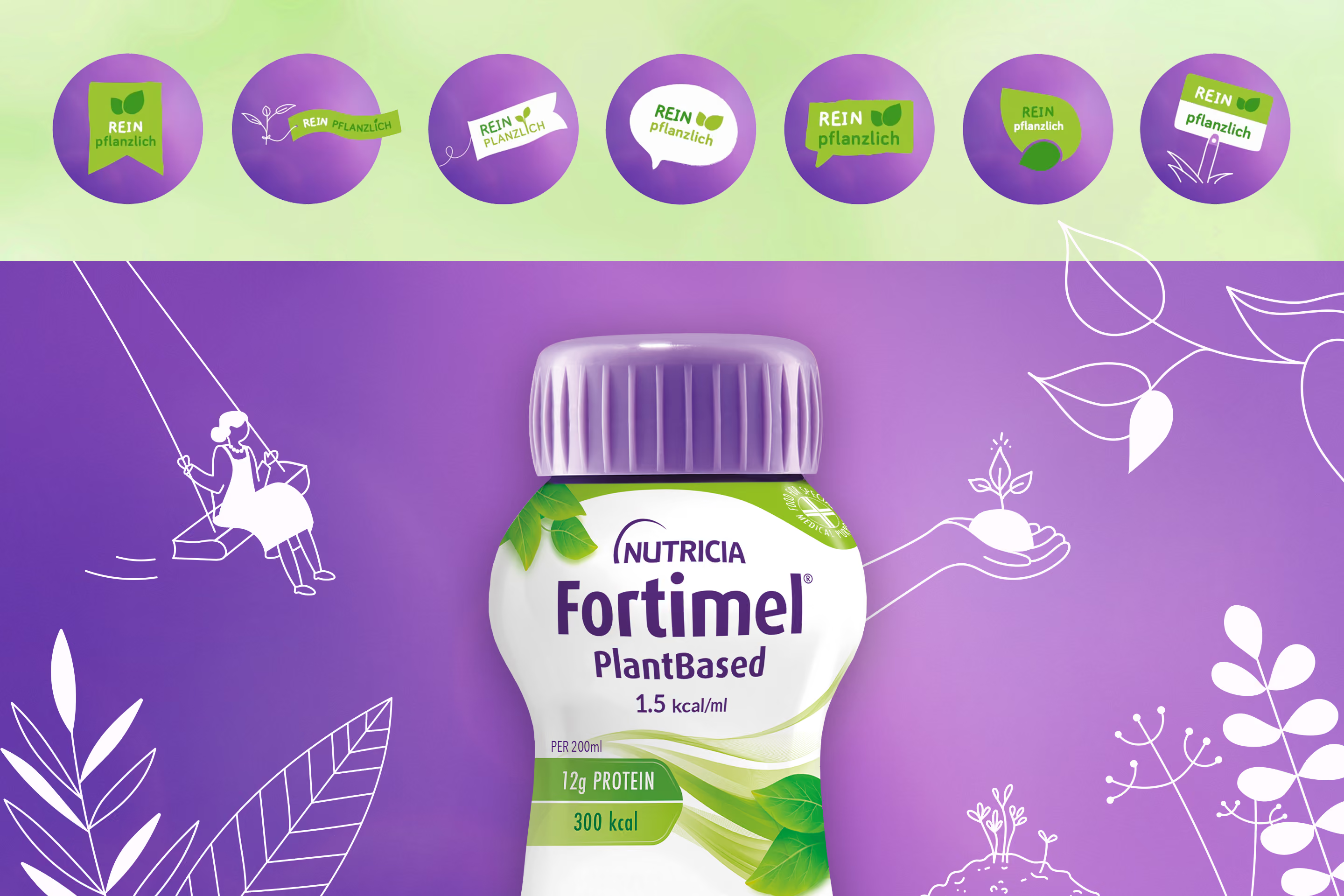
Using organic-style botanical scribbles and natural-looking imagery, plant-based nutrition was translated visually into the brand's signature look.

Recurring visual elements and the familiar Fortimel® scribble style ensured high brand recognition and an appealing, consistent look across target groups and numerous initiatives.

The campaign generated awareness for the new product and increased brand recognition among both HCPs and patients. The launch added an important component to the product portfolio.

Fortimel® is perceived not only as a pioneer but also as a competent partner in the field of oral nutritional supplements.
CONCEPT
Concept

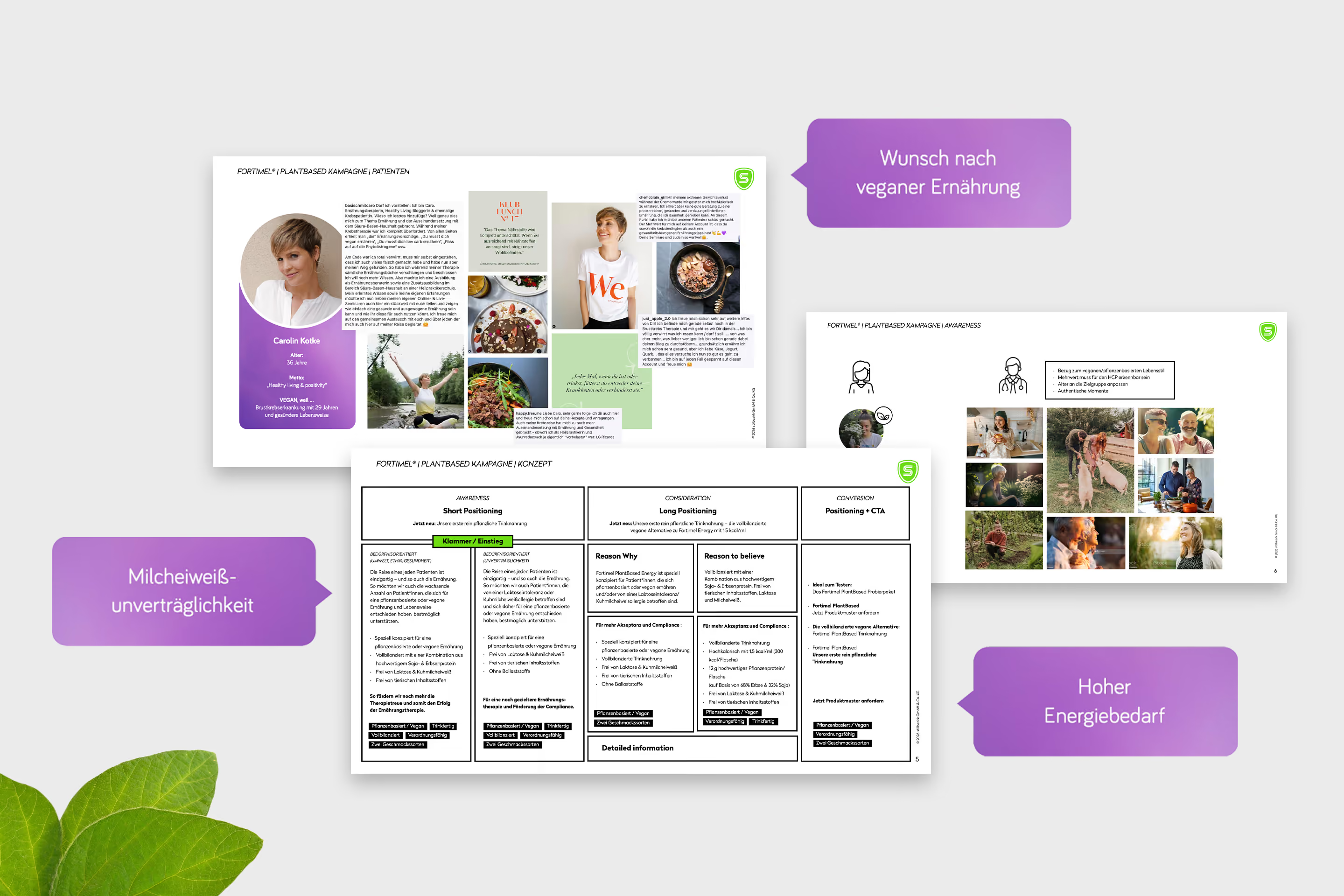
The conceptual phase began with an in-depth analysis of the motivations and facts surrounding plant-based nutrition. Based on these insights, we developed compelling messaging tailored to specific phases and target audiences. Under the banner "Fully plant-based, fully balanced," and supported by natural imagery, we created a powerful campaign concept that could be flexibly deployed across all touchpoints.

IMPLEMENTATION
Implementation

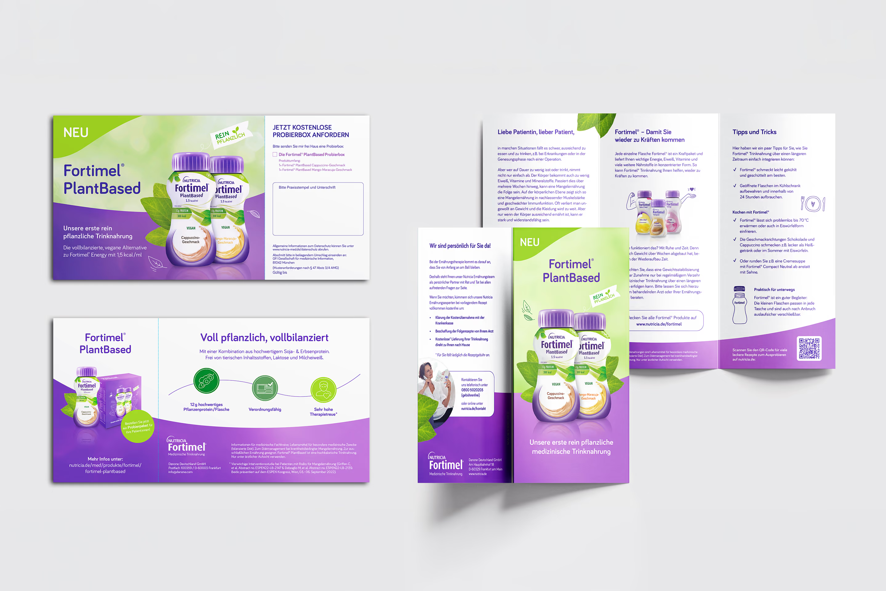
The campaign design combines a fresh color palette of green and Fortimel® violet tones with natural elements such as leaves, botanical scribbles, and the brand's signature wave motif. A light green background is used consistently and complemented by platform-specific imagery tailored to patients. This creates an authentic and approachable tone that reinforces the product's content and visually highlights its plant-based focus. The integration of a "100% plant-based" badge rounds off the cohesive visual language perfectly.

MEASURES
Measures

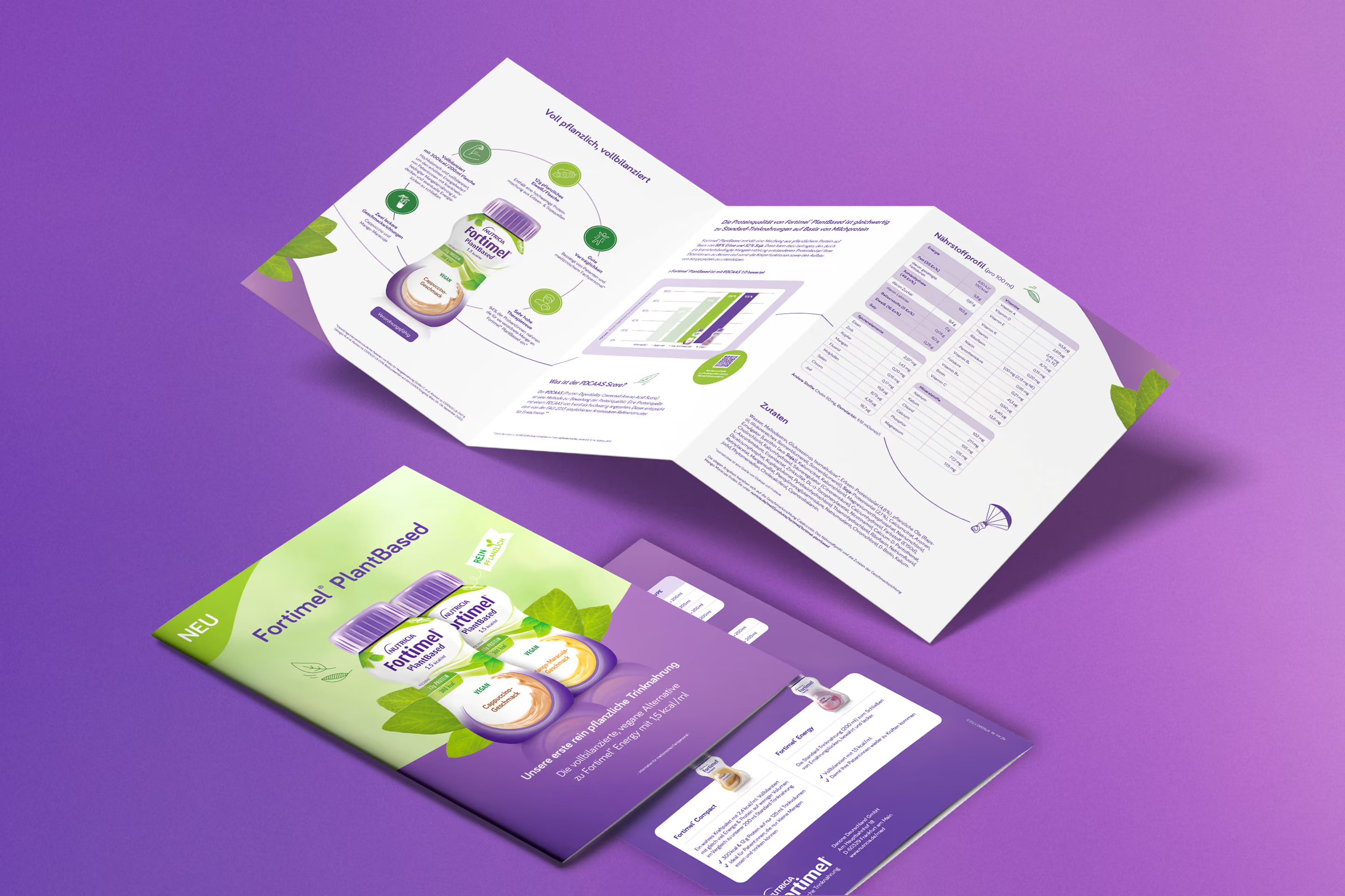
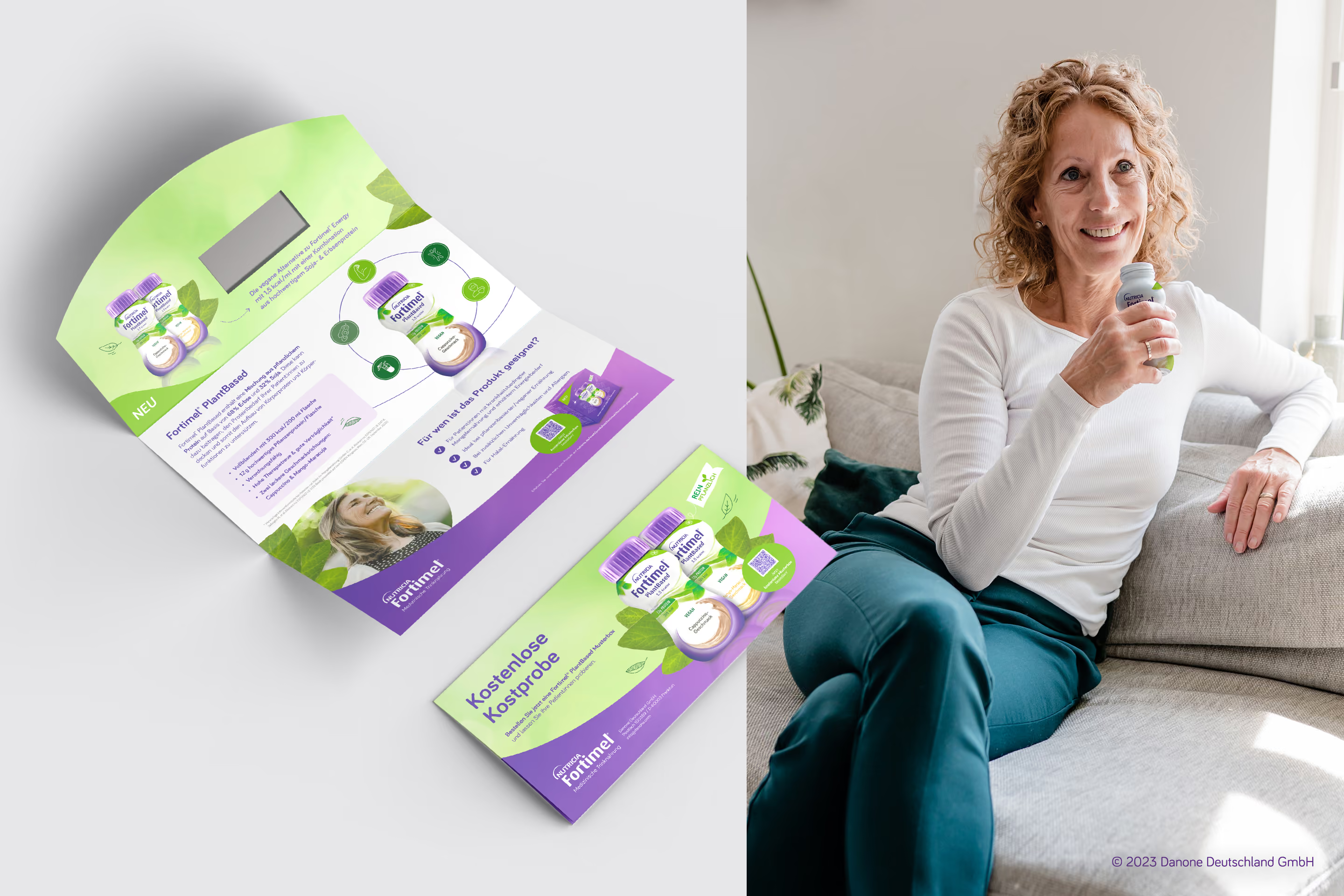
The developed visuals, graphic elements, and messaging were deployed across all channels: from static and animated social media posts and e-detailing to traditional communication materials such as mailings, an HCP folder, a patient brochure, and various print advertisements. Additionally, a sample box with a matching booklet was designed to bring the campaign concept to life through a tactile experience.
What other transformations has stilbezirk made possible?

Further projects that move brands.